Showing posts with label SU Cards. Show all posts

March 1, 2007

Patterned Paper Rocks!

I set out to make an anniversary card for my sweet in-laws and stamped images from the Stampin Up Fourishes set on the upper part of this card. I stink at trying to take individual stamps and make a background -- in fact, I've asked Splitcoast to do a tutorial on that issue. My backgrounds come out all weird and uneven and most unpleasing to the eye. Patterned paper to the rescue! My instinct would normally be to put the patterned paper on the bottom of this card, but I had to cover up my mistake. I already had stamped and embossed the focal image and if you are super sneaky, you'll notice that the patterned paper is not centered on the card, but this was the only scrap I had left of this gorgeous Basic Grey Blush paper. I think the stripes on either side of the center pink vertical design kind of hides the fact that this paper isn't centered properly. Either that, or just think that I'm avante garde and wanted it this way!! How I made this card: First, I seriously relaxed. I tried really really hard not to think about any other stampers or this blog and just took a deep breath and entered a zone where the only person I tried to please was ME (and possibly my in laws!!). Then, I found some business size envelopes in really nice paper from Crane's stationers in my stash of envelopes. I have NO idea where these came from!! However, they are lovely and inspired me to make a 4" x 9" card. Love this size!! Inked the large flourish from SU's Flourises in Close to Cocoa and then rocked the edges in Chocolate Chip (both by SU) ink and stamped on SU's Blush Blossom cardstock. Then I used the Flourishes Brassy Template from SU and dry embossed the image, mounted it on Chocolate Chip cardstock and inserted some SU Vintage brads. Adhered Basic Grey paper from the Blush collection to the top to cover up the mess I had made trying to make my own background, and then adhered a horizontal strip from the same sheet of paper to act as a bit of a faux ribbon. I adhered the focal image (no dimensionals -- this is going in the mail and I'm trying to avoid hassles with the post office). Stamped a couple of bigger flourishes in Versamark on the bottom of the card and then another smaller one (all from the same set) in Chocolate Chip on the edges. Stamped "Congratulations" (from Warmest Regards) in CC ink. The bottom of the card still looked too spare, so I remembered my cool new clear Paper Tray stamps from Paper Trey. I used CC Craft ink (pigment ink) and stamped two tiny little dots on each side of Congratulations. I loved not having to use a Stamp ma Jig to get these dots exactly where I wanted them. Note: I have so much more to share -- gifts dropping from the sky (ok, my mail box); other cards, etc. Sadly, my job expects me to show up on time! Gotta go.

February 20, 2007

Friends Matter

Indeed, they do! I made this card for Liz (Redapron on SCS), who has sent oodles of cute cards to my Mom and me. It's the least I could do! I knew when I saw the Love Matters set in the Winter Mini that I would eventually get it. I like the doodley style and love coloring it in. Reminds me of the way kindergarten was before the academic types took over and removed all the fun!! Don't they know it is downright therapeutic to color in the lines??? How I made this card: Not too much mystery to this basic layout. I sponged the Vanilla paper with Blush Blossom and Close to Cocoa inks and stamped "friends" and the little heart with Chestnut ink. I made a rough mask of the "friends" image and stamped over the main image with Aida Cloth inked in Blush Blossom for a little texture and interest. The heart background on the bottom of the card is just various heart stamps from the Love Matters set randomly stamped and colored with markers. Added the Olive strip of paper and the ribbon. It's hard to see in this pic, but the focal image is popped up on SU dimensionals. I like these because they are fairly thin and don't pop up too too much! This was an easy, but satisfying card too make. By the way, I decided to take this card to the post office to see how much it would cost to mail and to have it hand cancelled. Surprise! 52 cents! Just a thought when making cards to mail... Supplies: All supplies from Stampin Up except ribbon. Love Matters and Aida Background stamp sets; Ruby Red, Old Olive, Blush Blossom markers; Chestnut Memories ink, Ruby Red brads; Very Vanilla, Blush Blossom, Old Olive and Ruby Red cardstock; Dimensionals, and Paper Distresser.

February 8, 2007

Plum Sympathy

I need a sympathy card. I won't tell you how many versions of this card I went through before I settled for this. I think sympathy cards are the most difficult to make. So, yes I settled for this one. I've got to get this card in the mail today. I'm not thrilled with the results, but I think it is appropriate and just barely blog worthy!! Any suggestions on how this card can be improved will be most gratefully accepted -- will use your tips in future papercrafting. By the way, as I describe below, I used the Cuttlebug to emboss the light strip of paper under the mounted phrase. Can you see how the Cuttlebug appears to have changed the color of the paper? There is something about the flattening process the 'bug uses that results in a slightly brighter finish to the paper. Another development to ponder... How I made this card: Using Stampin Up's Perfect Plum Classic Ink, I stamped images from SU's Toile Blossoms on Pale Plum and Perfect Plum cardstock. (Can I digress to say how much I love Toile Blossoms??). I also stamped a sympathy phrase from a retired SU set (name not available to me!) on Pale Plum and mounted it on Perfect Plum and set it aside. I cut out flowers and using a Sakura tiny glue pen (purchased from Starlitstudio -- link on right), placed a few dots of glue on the flowers. I dipped the flowers in Dazzling Diamonds (a fine glitter -- Art Institute or other fine glitter would work just as well) and let the flowers dry. This little glue pen is awesome!!! The dark strip under the word image is Perfect Plum cardstock stamped with the Toile Blossoms. I wanted a piece of Pale Plum organdy ribbon, but I didn't have one, so I took some SU wide White organdy ribbon and put it on top of a piece of Pale Plum cardstock, which I had embossed using the Textile A2 Embossing Folder and the Cuttlebug. Sometimes placing the white organdy ribbon on darker cardstock will create a "faux" color ribbon of the darker cardstock. I put the card together and added a piece of SU Eggplant grosgrain ribbon to balance the card. Finally, I mounted the whole card on Perfect Plum cardstock. Tomorrow's post will contain the details on how one lucky bloggett can win a $50 gift certificate for SU products! Now, there's a tease!!! (Hint: think black and white).

February 2, 2007

Thanks, Teach!

First, the card. This is a rather large 5 1/2" square card for one of my son's teachers. Teachers are just amazing folk -- overworked and underpaid. There are few things on this earth more valuable than a good teacher. Janis is a great teacher! Janis taught my son Algebra almost 4 years ago but has remained a mentor and special person in my son's life. She met with me today (on her day off) to discuss which courses Andy should take in school next year. So, of course, a least a handmade card is called for! Note: the picture of the card is more true to life than the detail. However, sometimes seeing a close up of a portion of a card can be kind of fun, even if the color gets a bit twisted. Card details: I stamped the flower from Stampin Up's Heartfelt Greetings in Memories Chestnut Brown ink. Then, using my trusty Stamp Ma Jig, stamped the inside of the flowers with SU's Cranberry Crisp. I picked up my aquapainter and colored in the center of the flowers by just rubbing the brush on an SU More Mustard Classic ink pad, and swooshed the brush around the flowers as well. After they dried, I cut them out by hand and added a bit of golddust on the centers with a Sakura Stardust Gold Pen. The base of the card is SU's Blush Blossom, as is the strip directly under the flowers. That strip is stamped with SU's Aida Cloth background stamp inked with SU's Close to Cocoa Classic Ink. The strip looked awful so, I tried the aquapainter to spread some Cranberry ink on top of the strip. That one addition -- the Cranberry Crisp on the strip -- made all the difference in the card, and helped pull it together. Without it, the strip underneath the flowers just sort to sat there, not looking happy at all! If you look closely, you'll see a bit of rose ribbon under the flowers and the strip itself is mounted on a piece of striped paper that is part of the Basic Grey Blush collection. The "Thanks" is also from Heartfelt Greetings and was stamped with Cranberry Crisp on Blush Blossom, and then pressed onto the leftover ink on the Aida Cloth. I used the aquapainter again to move some of the Cranberry ink around the word and soften the look, and then mounted the word on some more of the Blush collection paper, used SU's ticket corner punch on both edges and adhered using SU's Copper Hodgepodge Hardware brads. The patterned paper covering most of the front of the card is also from the Blush Collection (if you peek really well, you'll see that I punched tiny holes in that paper so that some of the paper underneath would show through). Finally, I used the ticket corner punch on the patterned paper before adhering to more of the Blush collection paper. Second, about the blog and Feedblitz -- Whew! After I posted a message indicating that I could not fix it and would find another service, within moments, up popped a comment from someone at Feedblitz indicating that they had fixed the problem!! I guess someone's reading this blog -- LOL One final thought on the blog -- it is so fun watching folks read and comment and getting emails and messages about the blog. Makes me feel very connected to my fellow stampers. I encourage you to subscribe now that the Feedblitz problem appears to be fixed!

January 21, 2007

Remember Glossy Cardstock?

Way back -- 4 or 5 years ago -- an SU demo showed me how to brayer on glossy cardstock. Wow! So shiny and mysterious looking! It got me hooked on stamping and on Stampin Up. I haven't used glossy cardstock in a long time. It is old hat for serious stampers, and a bit passe in some stamping circles, but it almost always gets a "how did you do that?" reaction from a non-stamper. So, today I pulled out some glossy cardstock and felt like I was back in Stamping 101. Too much fun!! All supplies are from Stampin Up, unless noted: Stamps: Both Way Blossoms and Circle of Friendship; Glossy, Black, Garden Green and Pixie Pink cardstocks; Black Memories Ink; Assorted Markers; YoYo Yellow, Saffron, Summer Sun, Mellow Moss and Garden Green dye inks sponged onto the background; Black Gingham Ribbon; 1 inch cirlce punch (not SU); 1 1/4 and 1 3/8 circle punches. (The Circle of Friendship fits perfectly into a 1" round punch).

Dry Embossing Without a 'Bug!

I made this card for a dear friend, who will be turning 60th this month. I added a close up of the details so that you could see how lovely dry embossing is -- and did it by hand! No Cuttlebug! I hope Stampin Up continues to make brass stencils that coordinate with their sets, as they are indeed lovely. This particular stencil also includes piercing holes to make piercing around the images a snap. Got to love it! For those of you that are unfamiliar with dry embossing, you use a Light Table (available at most craft stores and through Stampin Up, and a metal embossing pen with a ball tip called a stylus. Place the stencil on the table (turn on the table -- the light from within the table is what helps you see through the paper to the stencil.) Tape the stencil to the table in a few places so that it doesn't slide around. Rub wax paper over your cardstock. Place the cardstock over the portion of the stencil that you want to emboss and, holding firmly, trace the the stencil with your embossing stylus over the waxed cardstock. Keep moving the paper over the portions that you want to emboss. This is time consuming and can also be a bit stressful on the hands -- but the old fashioned way allows you to use part of a stencil anywhere on cardstock or vellum, while folders like the Cuttlebug produce a full quarter page embossed in 30 seconds, but with no ablility to use parts of an image. Each has its place in the aresenal we are all accummulating!!! Supplies Used: All Stampin Up, unless otherwise noted: Bodacious Bouquet Stamp Set and coordiating Brassy Template Stencil; Crafter's Tool Kit, White, Pretty in Pink, Mellow Moss, Lovely Lilac and Cardstock Vellum cardstocks; Earth Elements Brad; Lovely Lilac Craft ink; Mellow Moss dye ink; Non- Stampin Up: computer generated saying; light table, stylus, japanese screw punch.

January 19, 2007

Hot Press, Cold Press?

A few weeks ago I received yet another gift in the mail from a blog reader. There are amazing folks out there!!! Linda Carson sent me some "hot press" watercolor paper to try out and compare to "cold press". In this case, it is Arches, 90 lb. Natural White. I used this paper on this card - both for the main image and the saying. I love to watercolor -- and am in the process of teaching myself. It doesn't come naturally to me, but I absolutely love it as I find it so relaxing. I have always used "cold press" 140 lb. watercolor paper, so switching to hot press was fun and educational. So what's the difference? The cold press I've used is much heavier and has a bumpy texture -- not so bumpy as to make stamping impossible, but you can feel the texture. This hot press paper is quite smooth. The hot press is definitely preferable for stamping words, especially the small ones used in this card and for stamping in general. Of course, it is possible to buy heavier weight hot press and lighter weight cold press, but generally, the hot press is smoother, and will buckle more easily than a rougher sheet of cold press watercolor paper. The main image on this card buckled quite a bit, but was very easy to smooth down -- I just used some double sided tape to place it on the red cardstock layer and it behaved quite nicely! It is hard to explain, but the 2 papers "take" the watercolors differently. I used dye reinkers for this card -- I've found this the best way to get an intense color, and I definitely wanted bright, intense colors for this card. I squeeze one drop of reinker onto the inside lid of the same color ink pad and use an aquapainter to pick up the color. The reinker will stay on the inside lid of the ink pad and will be usable for ages! Watercolor paper has a finish that allows the color to float on it until it dries, making blending and removing colors so much easier than on any other type of paper I've tried. The hot press paper absorbed the ink more quickly, making removing ink with a paper towel or sponge more difficult. (Removing color that has just been painted on watercolor paper is a quick way of lightening a section of an image -- just dab a paper towel before the paint or other medium has had a chance to set and voila, you have totally clean watercolor paper.) This technique works -- for me -- better on cold press. However, I've seen a watercolorist use this technique on hot press, so I think it is a question of just getting used to the different paper, and having talent! Thank you Linda! Supplies used on this card: Stamps: "And Everything Nice" and "Dotted Background" by SU; Cuttlebug Slider Die Cut; SU YoYo Yellow, Ballet Blue, and Real Red reinkers; SU Chocolate Brown, Blush, Black and Orange Markers; Memories Black ink and Versamark (on the Dotted Background); SU Real Red brads, Aquapainter, Arches 90 lb. hot press watercolor paper in Natural White, SU YoYo Yellow, Real Red and Bashful Blue cardstock; dotted ribbon (source unknown).

January 17, 2007

All Purpose Card

I have a small stash of all purpose cards. My goal for 2007 is to grow this stash, so that I'm not running around at the last minute for a card. I'm guessing you know exactly what I mean!! This card was made using the now retired Terrific Tulips -- long may this set live! Other supplies used: Weathered Backgrounder by Cornish Heritage Farms, Creamy Caramel (on the background), Apricot and Pumpkin inks, Stickles, earth element brads, Artichoke Marker, White, Artichoke and Creamy Caramel Papers.

January 14, 2007

Simple Get Well

I was browsing Julie Ebersole's blog (Paper Trufflez, linked on the right) earlier today, and she posted an adorable card and suggested that others try and take her sketch and make a card from that sketch. While I didn't have her sketch in front of me, this card was inspired by her sketch. I hesitate to link one of my cards to one of Julie's dynamite creations, but I'm being bold this afternoon! I liked this card enough to plan on making a bunch more -- only in the future I'll move the saying up a bit. Talk about fast! Supplies Used: SU: Both Way Blossoms and Curvey Verses; Hero Arts Rectangle Block. SU's Pretty in Pink ink, and Rose Red and Always Artichoke Markers. The gingham ribbon is from Offray. Adhesive? NONE!! To answer a question from a previous posting -- the You Light Up My Life card (with the 9 scalloped squares) is a standard A2 card (5 1/2 x 4 1/4). It looks square because I left room for the ribbon between the first and second rows of mice. A bit of an optical illusion.

January 12, 2007

He Lights Up My Life

Supplies Used: Stamps: A Happy Hi and Mini Mates (SU); Cuttlebug die cut for the scallop square; SU 3/4" square punch; May Arts Polka Dot ribbons (purchased from Cindy at StarLitStudio on ebay); Stamp Ma Jig; Real Red, YoYo Yellow, White, and Black SU Cardstock; SU Markers for the colorful mouse! The saying -- You Light Up My Life is from Mini Mates and is not on one line (sadly). So, I very carefully used the Stamp Ma Jig to line up the saying and used a Black Marker to stamp each line, carefully cleaning off between stamping the second half of the saying. My husband loves color (see post below!), so he'll get this card tonight -- before he has a chance to see it on the blog.

January 2, 2007

Paying It Forward

My turn to send a RAK. A call for cards went out on the Gingerwood Bulletin Board earlier this week for a young woman with an agressive form of leukemia, which was detected right before Christmas. Supplies Used: Friends Are Like Flowers and Warm Words (SU), and Squiggles (TAC) stamp sets. The main image is watercolored using SU Watercolor Crayons and mounted on Pixie Pink, Close to Cocoa, and Tempting Turquoise cardstock. I stamped the Squiggles and the Thinking of You sentiment with SU's White Craft Ink, and punched out the two circle designs from SU's Loves Me Designer Series paper. The brads are from SU's Bold Bright series. Both the main image and the circles are popped up on dimensionals (my latest obsession!). TAC has some really nice looking squiggle, ribbons and other flourish type sets. I think a new one is coming out soon and worth investigating! Coming up soon on the blog: an article highlighting some small business owners in the craft field and more paper comparisons (this time metallics!).

December 28, 2006

Two Sassy Bugs

The first Sassy Bug is my son Andy holding the second Sassy Bug, my first card made with my new Cuttlebug! Both guys are too cute!! Supplies used on Andy: love, patience, money, and humor. Supplies used on card: Cuttlebug A2 Embossing Birthday Folder; Stampin Up Sassy Stems and Flannel Plaid Background, Ticket Corner Punch, Markers; Whisper White, Bordering Blue, and Apricol Appeal cardstocks; brads; pastels; dimensionals. Also, I discovered a new trick -- the scissors SU sells to cut their stamps (Kai) also will cut off the prongs on brads! On another note, Liz (Redapron on Splitcoast) is sending me a sample of Georgia Pacific cardstock to compare to SU and Beckett Expressions. Liz is the most kind, generous woman I've never met! More on Liz in another post!

December 27, 2006

Welcome Keefer!

Welcome to the world, baby Keefer. This card is for Jennifer and Dave, who recently had a darling baby boy. Supplies used (all by Stampin Up): Feathered Friends, Aida Cloth, Script; Watercolor Crayons; Watercolor Paper, Barely Banana, Bashful Blue and White Cardstocks; Blue Gingham Ribbon; Brads. In addition, I used Black Memories ink and 1/8" dimensionals to pop up the main image.

December 25, 2006

Paisley Birthday

Now that the rush to produce Christmas cards is over, I'm back to birthday and other items. I decided to experiment with using only two colors -- in this case, Cameo Coral and Night of Navy. Stamps: Paisley Print Background and Happy Everything by SU and a ribbon set by TAC. I also used the tool kit by SU to align and punch the holes. The size is a little less than 5 1/2" x 4 3/4". The card started out as a square card, but I decided it needed more navy so it "grew" horizontally. My husband likes the layout, but not the colors, so I think I'm going to make this same card in totally bright colors, which are his favorites, and see how that looks. Stay tuned! Also, I'm now the proud owner of both the Cricut and the Cuttlebug. An embarrassment of riches in the craft arena! I'm determined to play with and use both, so stay tuned for that as well! I hope you all had a Merry Christmas, and for those of you that do not celebrate Christmas, a Happy Hannukah.

December 24, 2006

Keep In Touch

I made this card for a co-worker who is leaving for another job in a couple of weeks. Stamps: SU's On the Move and Soft Swirls for the background. Cardstock: SU White, Pixie Pink and Cool Caribbean. Gingham ribbon from the dollar bin at Michaels! I also used Ranger's Glossy Accents on the tiny heart on the envelope and on the parts of the cute little bird.

December 16, 2006

Simple Merry Christmas

So called "simple" cards are, at least for me, very difficult to pull off. Simple easily becomes boring. I'm not where I want to be on simple cards, but I thought I'd post this effort, nonetheless! I used SU's Holiday Thyme Paper for the tree and Mini Mates for the Star. (The idea of creating a tree with patterned paper is from Julie Ebersole). I punched holes in the tree with my Japanese screw punch (awesome tool). I stamped "Merry" in Thyme ink, using a set of clear polka dot alphabets from Amuse Arts, trying my best to align the letters with a Stamp Ma Jig. I used an SU Real Red marker for the dots in the tree and for the star. The card itself, a 4.25" square, is made out of SU's Naturals Ivory paper.

December 15, 2006

Snowing

I inked up the Gently Falling peace stamp from last year's Sell a Bration set with a Blue Frost Kalaidecolor pad on Shimmery White paper, and then added some sparkly stickles. I used a stamp from Itty Bitty Backgrounds to create the idea of snow on the various layers, stamping with White Memories and SU's Brilliant Blue inks. I added a little ribbon to pull the layers together -- I think a darker ribbon might have worked better, but amonst the scads of ribbon, I did not have one blue that would work with these colors! So sheer white organdy was my best option. On an entirely unrelated note, my Mom is back in the hospital -- thus my absence from the blog for a few days. I suspect she'll be released over the weekend.

December 10, 2006

Bunch of Happy Snowpeople!

A bunch of happy snowpeople needed a happy looking color combo, so I checked my SU color combo wheel and settled on Creamy Caramel, Real Red and Ballet Blue. I used Confetti White paper from SU on which to stamp the snow people from the hostess set, The World Over, in Black Memories ink (my favorite), and used markers to color in the little snow folks. Other sets used: snow from Trees Three (stamped with white Memories ink) and Riveting (which I am using like crazy lately). This stamp set consists of 3 similar shaped stamps -- and I was really stumped by this half circle, until I saw a card by "atomicbutterfly" on splitcoaststampers. She used a circle stamp underneath the main image on her card, and it just brought it altogether. I'm so glad the internet exists!!!

December 9, 2006

Noble Effort for a Masculine Card

Supplies Used: SU Noble Deer, Flannel Plaid, Cheesecloth, Riveting. Inks: Versamark, Old Olive, Close to Cocoa, Creamy Caramel. Other: Photo Corner Punch, Pastels, Sponge, Circle Punch. SU does not have a circle punch small enough for Riveting! So frustrating, so I just hand cut the stamp and layered it on a 1 and 1/4" SU round punch. Paper: Old Oive (yes, the color is way off in the picture), Close to Cocoa, Chocolate Chip and Ivory Naturals. I stamped the main image with versamark and then used pastels to pop out the image. Then I gently laid the image on Cheesecloth that had been inked with Creamy Caramel. I bought Noble Deer after seeing what Debbie Olsen did with it, so this card is inspired by Debbie! I had fun making it, but could never quite figure out how to finish off the card with the riveting image. Not sure it works, but I think the recipient of this card will not mind one bit! On another note, I think I've figured out how to edit a photo in MAC. The education continues. Thank you, Laura, for some tips!

September 30, 2006

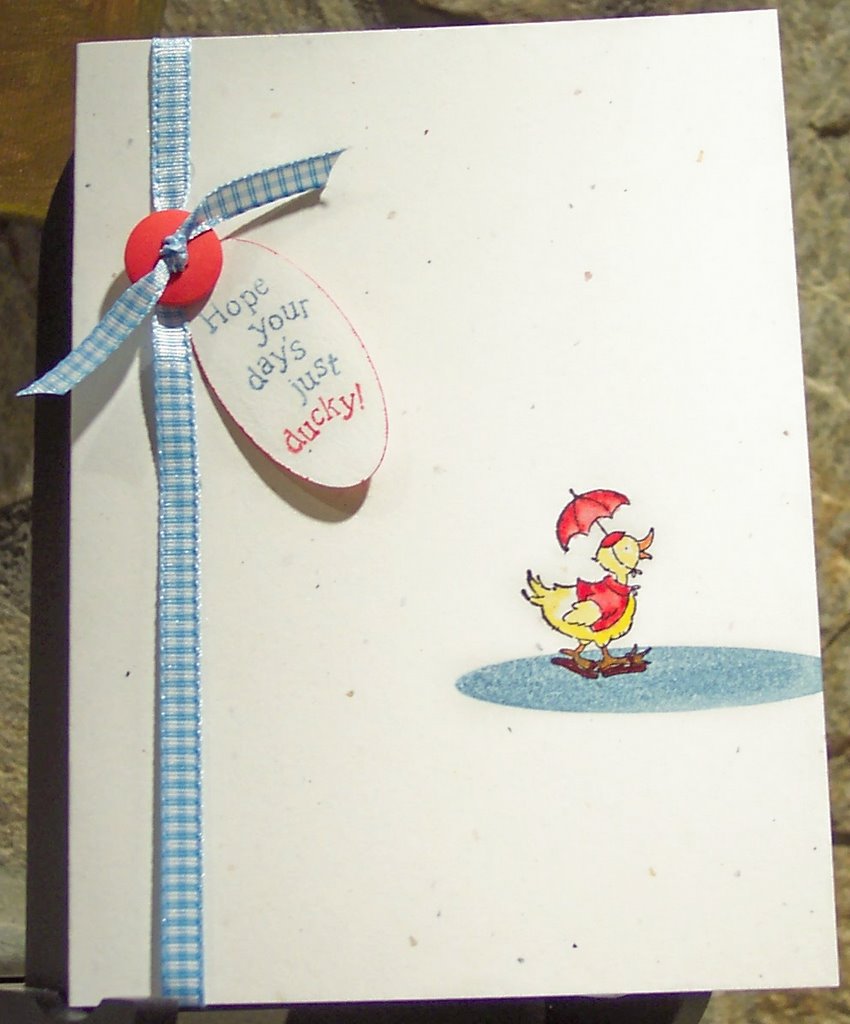
Just Ducky

Isn't this little duck just the cutest??? The design of this card was inspired by Julie Ebersole's Amuse Arts designs. You can find all of Julie's amazing work at her blog, Paper Trufflez, which is on my blog's list of "must sees." The duck and saying are from SU's "A Happy Hi." Of course, I should have masked the duck's feet on top of the "water," but, I thought I could get away without it -- and I was wrong!! While I really like this card, I'm a little unhappy with the scale of the saying vs. the duck -- either the duck should be a tad bigger or the saying a little smaller. Nevertheless, I think this card will be just perfect for a friend of mine who is going through a rough patch. Supplies Used: stamps: SU A Happy Hi and A Muse Arts oval. SU markers: Brocade Blue, Real Red, YoYo Yellow and Only Orange; Black Memories Ink (my favorite permanent black ink); SU blue gingham ribbon, SU large oval punch, SU real red button, and SU confetti white cardstock. Aquapainter; mini glue dots for the button and ribbon.